 By admin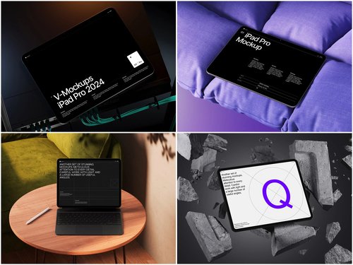
A blank screen floating on white background tells you nothing about a product. Place that same screen on a wooden desk, in someone’s palm, or in a sunlit kitchen, and the viewer’s brain starts writing a story. That’s the quiet power behind every well-chosen iPad mockup: it doesn’t just display an interface, it frames how people feel about it before they’ve read a word.
Designers often treat context as a styling afterthought. In practice, the setting is part of the message. A finance app photographed on a marble desk reads as trustworthy and serious. The same app shown mid-scroll in a hand on a train reads as fast and personal. Same product, two different psychological pitches.
Why Setting Changes Perception
Human brains read environments for social and emotional cues before consciously analyzing what they’re looking at. Advertising psychology consistently shows background context shapes purchase intent as much as the product itself. Apply that to app presentations, and the mockup you choose becomes a silent persuasion tool.
Three cues do most of the psychological work:
- Lighting: warm light suggests comfort, cool studio light suggests precision.
- Surrounding objects: a coffee cup implies creative work; a plant implies calm, wellness use.
- Framing distance: close-ups feel intimate, wide shots feel aspirational.
The Desk Scene: Authority and Focus
Desk-based scenes remain the default for a reason. They signal productivity, structure, and seriousness. This context works best for B2B software, portfolios, or any product wanting to be seen as a tool rather than a toy. The desk also gives room to layer in branding elements like notebooks or secondary devices without crowding the screen.
The trade-off is emotional distance. Desk scenes rarely spark desire; they communicate competence instead. That’s why SaaS dashboards and productivity apps lean on this setting so heavily, while lifestyle brands tend to avoid it.
The Hand-Held Scene: Trust and Intimacy
Nothing signals “real product, real use” faster than a hand holding the device. This context shortens psychological distance, because the brain automatically imagines its own hand in that position. It’s one reason app store screenshots often rely on a well-produced iPad mockup held at a natural angle rather than propped on a surface.
Hand-held framing also implies scale and portability, both of which matter for apps built around mobility, note-taking, or creative sketching. The downside is that poorly lit or awkwardly cropped hand shots can look staged, undermining the authenticity they’re meant to project.
The Lifestyle Scene: Aspiration and Narrative
Lifestyle scenes go furthest into storytelling. A tablet beside a coffee on a balcony, or open on a bed in soft morning light, sells a feeling rather than a feature. This context suits consumer apps, wellness products, and creative tools where the goal is emotional identification over functional proof.
The risk is dilution. If the scene is too busy or too generic, the product gets lost in the props. The strongest lifestyle mockups keep the environment suggestive, not overwhelming, letting the screen content stay the visual anchor.
Real-Life Examples of Mockup Use in Practice
This isn’t theoretical. Context choice shows up constantly in visible ways:
- App Store and Google Play listings: developers are encouraged to show apps in believable settings rather than isolated screens, so many listings mix desk, hand, and lifestyle shots in one gallery.
- Dribbble and Behance portfolios: designers routinely present the same UI in multiple mockup contexts within one case study, letting clients judge craft and market fit at a glance.
- Product landing pages: SaaS companies often pair a clean desk mockup in the hero section with a hand-held mockup further down the page, shifting tone from “professional tool” to “part of your daily life.”
- Crowdfunding campaigns: hardware and app-adjacent products frequently lead with lifestyle scenes to build emotional buy-in before specs are introduced.
Resource libraries built for this purpose, such as free iPad mockup collections, exist because teams need fast access to varied contexts without commissioning new photography for every scenario.
Choosing the Right Context
There’s no universal best option here, only the right fit for the message. Before picking a scene, ask what the viewer needs to believe about the product in the first few seconds.
- Use desk scenes when credibility and professional tone matter most, especially for enterprise tools or portfolios aimed at clients who value precision.
- Use hand-held scenes when you need to prove real-world usability and comfort, particularly for mobile-first apps.
- Use lifestyle scenes when the goal is emotional connection, which works well for wellness products or consumer brands selling a feeling.
Budget and timeline matter too: lifestyle staging takes longer than a clean desk shot, so teams often default to simpler contexts under deadline pressure.
Many strong presentations combine all three, guiding the viewer through an emotional arc from trust to intimacy to aspiration.
Conclusion
Context is never neutral in visual design. Every desk, hand, or lifestyle scene tells the viewer how to feel about a product before a single feature is explained. Treating mockup selection as a psychological decision, not just a styling choice, separates forgettable presentations from ones that actually persuade. For designers who want that range without building each scene from scratch, libraries like ls.graphics offer a practical starting point for testing which context tells the right story.